

There is so much information about COVID-19 that it can be confusing to find and sort through. High-risk autoimmune patients may be particularly interested in tracking the pandemic. In this post, we link to trackers, charts, and dashboards that aid in following the global spread, especially for visual learners. We also explain some need-to-know background, including SARS-CoV-2, viruses, and especially exponential growth.

COVID-19 Trackers
Johns Hopkins Dashboard
This Johns Hopkins dashboard is spectacular, but only shows the current situation, not the time series. For various reasons, the underlying data may not be up to date. Also, in many places, we do not yet have solid data. That means we don’t know how many people are actually infected. Nor is data accurate or timely on how many have been tested, diagnosed, hospitalized, are in intensive care or dead.
Here’s a version using the same data set with an animated timeline going back to January 1. Zoom in for more geographic detail.
A Dashboard from Our World in Data
One of the most popular data visualization sites, Our World in Data, has pages of COVID-19 visuals. These rely on data from many sources. Thus, fog-of-war pandemic caveats currently apply (as they explain with regard to the WHO data set). However, it is updated daily and has country-by-country data and doubling times. In addition, they have more data, tables and visualizations, as well as explanations about data quality and timeliness.
University College graphs
Mark Handley, at University College London produces daily graphs, showing the growth of confirmed (undercounted) COVID-19 cases in most affected countries, provinces, states and cities around the world. He also graphs cases per million population (useful to see rates). Also, you can quickly compare how different places are in the growth curve, some exponential, others beginning to flatten out. Death counts are the most solid data we have, but even death data is not consistent from place to place. The data from the PRC is completely unreliable. Therefore, the China and Wuhan curves reflect reality even less than the rest of the graphs.
NextStrain: SARS-CoV-2 phylogenetics
With scientists based in Seattle and Basel, NextStrain was already studying influenza virus genomics and epidemiology. They quickly started modeling SARS-CoV-2 as soon as sequences became available from Asia. As you can imagine, they accelerated their work when the outbreak started in Washington State! This is somewhat technical, but they were way ahead of everyone else (eerily predictive data early in January).
Their research shows us mutations of the virus that enable them to track it back to its source in Wuhan. There is a gap in November-December where the CCP ordered samples destroyed and data deleted. You can also follow @nextstrain, Trevor Bedford @trvrb and Emma Hodcroft @firefoxx66 on Twitter for daily updates, commentary and retweets of other interesting virologists.
There are many other maps and COVID-19 trackers online. If you know of any other COVID-19 trackers you think we should feature, let us know in the comments.
What is SARS-CoV-2?
SARS-CoV-2 is a species of coronavirus. Coronaviruses (CoV) cause many types of respiratory illnesses in mammals and birds, including the common cold. They are named after the crown (corona) of spikes on all members of this family of RNA viruses. Coronaviruses use these protein spikes to pierce host cells that they hijack to reproduce.
Viruses are unable to reproduce on their own and therefore must insert their RNA (or DNA, depending) into a host cell and hijack that cell’s reproductive mechanism to make more viruses. This eventually kills the host cell, releasing large numbers of new viruses that can infect more cells. Viral infections can rapidly spin out of control without proper immune defenses. Uncontrolled infections kill an exponentially growing number of host cells, and eventually, the host. That means us.

What is a virus?
Most people today are familiar with computer viruses, but don’t know that they are so called because their behavior is statistically similar to that of disease viruses! Viruses are ancient (probably first appearing on Earth 3-4 billion years ago) self-replicating nano-machines, not quite alive. They consist of a DNA or RNA core surrounded by a protein coat and in some cases (including coronaviruses) a protective lipid bilayer. They are equipped with nano-mechanisms, like the protein spikes on coronaviruses, that enable these ~120-nanometer particles to infect cells. Breaking up that lipid bilayer is how washing with soap, detergent or alcohol destroys coronaviruses on surfaces, including your hands.
Viruses are parasites, meaning they cannot reproduce without hijacking living cells. Thus, they are major pathogens for humans and all cellular life, including bacteria. (A subset of viruses called bacteriophages specialize in parasitizing bacteria.) However, viruses are also likely sources of cross-species transmission of genetic information. In that sense, they have probably contributed positively to evolution, not just by presenting a survival threat. That itself has forced and shaped the development of defenses against them by cells and multicellular organisms.
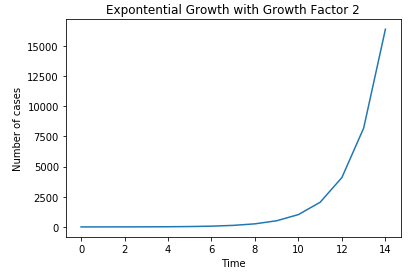
What is exponential growth?
Exponential growth is a statistical concept used in epidemiology to model the rapid growth of epidemics and pandemics.
Exponential growth is easiest to understand by thinking of a simple doubling process. Start with a population of 1 and multiply each result by 2. Try running that doubling in an Excel spreadsheet. By the 21st doubling, 1 has multiplied into more than a million. On the next doubling, more than 2 million. By the 41st doubling, more than a billion! It’s called exponential because it can be more tidily expressed using exponential notation (Xy, in this case, X2). In fact, after a large enough number of doublings, the only way to express it is with exponents or on a graph.
On a graph, exponential growth looks like this:
Doubling and constraints
Exponential growth to the power of two applies to things that double naturally, like cells. Following the logic of exponential growth, it would entail that we contain an infinite amount of cells. However, since we are not drowning in our own cells (or bacteria), it is clear that in the real world, there are constraints on this curve. Some bacteria starve and die without reproducing. Others die under unfavorable conditions, like too dry or too hot. Some are eaten by predators (other bacteria, fungi). Bacteriophages kill many. Others are devoured by phagocytes (“eaters of cells”) in the immune systems of animals they infect. In multicellular organisms, cell growth is constrained by various mechanisms. Unconstrained cell growth is the hallmark of cancer.
The unconstrained model is worse than a power of two in the case of a viral disease. This is because viruses that hijack cells produce more than 2 viruses with every successful takeover. Even then, there are constraints that prevent the entire planet from being smothered in viruses, including chance: the virus lands on a hot surface or is exposed to UV light or chemicals like soap or alcohol and is destroyed.
How do our immune systems deal with a new virus?
The innate and adaptive immune defenses of host cells kill many viruses. Such defenses range from simple barriers and chemicals in bacteria to the complex immune systems of humans. However, our adaptive immune systems (the ones that remember diseases and vaccine encounters) have NEVER encountered SARS-CoV-2 before. Thus they have neither memory T and B-cells or circulating antibodies against the virus. Humans need around two weeks to develop such defenses against a new strain. Therefore, for those first days, only our innate immune defenses (fever, cytokines, phagocytes), are able to fight the infection.
Thus, in epidemics in a vulnerable population (one that has not been exposed to the virus), the number of cases initially follows exponential growth curves. This is scary because uncontrolled infections move rapidly (doubling times of days or less) through populations (bacteria, plants, animals or humans) and can kill many of them.
The limitations of models
This rather technical post is a critique of the Imperial College model, the one that triggered drastic government action in the UK, the US and elsewhere. It also serves as an excellent primer about the challenges of modeling epidemics. Lemoine discusses assumptions and other issues that make modeling the real world of viruses and human behavior so complex. Only in the past 10 years have we have developed the computing power (big data), speed and data sets to calculate models in near-realtime.
There are other mathematical concepts that try to more realistically model epidemics. These take into account networking effects that describe how people infect others. Network effects and hub-and-spoke connections are well understood in the context of internet engineering applications as well as in epidemiology. Hub-and-spoke analyses are useful in understanding superspreaders. For example, Patient Zero in Seattle. Plus Patient 31 in South Korea, with her church and buffet as hubs and her large number of close contacts as spokes.
This is a source of hope because we can’t do much about the virus itself yet (no proven treatments or vaccines). There are several promising drugs that are being trialed under compassionate use. All we can do is keep the most severe cases breathing until their own immune systems kill enough virally infected cells and mop up the viruses.
How do we slow exponential growth?
Until we have more testing and proven treatments, we can only monitor the pandemic using data and in-kind, modifying our own behavior. This can break the spokes, reduce the number of hubs, and slow network transmission below an exponential. This is “flattening the curve,” that is, reducing transmission widely to prepare for the surge of expected cases, especially those needing hospital and intensive care.
This Forbes article explains the statistical issues clearly in the context of the COVID-19 pandemic, including exponential growth, doubling times and real world data.
Our next post will provide historical perspective vs past flu pandemics. More posts will explain the crisis in hospital capacity, describe mitigation strategies and tactics, as well as the testing bottleneck.
Let us know your thoughts!
The COVID-19 pandemic is a rapidly moving situation. It’s hard to keep up with the tsunami of information, misinformation, and disinformation. There is a high noise-to-signal ratio, especially on social media. Let us know in the comments if you have sources to share, questions, or see errors or outdated information. Also let us know if there are additional topics you’d like us to tackle.
Stay well!
This post had a lot of data visualizations. If you want to see non-COVID-19 data visualizations that can apply to your personal health, enjoy the posts below:
Previous COVID-19 Posts:
- Useful Basics for Autoimmune Patients around COVID-19
- Stories of Self-isolation and Functional Medicine Advice for Autoimmune and Immunocompromised Patients
- Important tips on Food Safety
- An Overview of the Spread of the COVID-19 Pandemic. From China in November to the World in March, with links to news and information sources.
Written by: Bonnie Feldman, DDS, MBA, Ellen M. Martin, Annie Rooker


2 Comments
Historical Perspective on Flu Pandemics. Mitigation of COVID-19 Through Isolation. SARS-CoV-2 Testing Problems: Part Five – Your Autoimmunity Connection · March 29, 2020 at 3:09 pm
[…] Background for immunocompromised and everyone: COVID-19 pandemic, coronaviruses, epidemiology, links…. […]
Autoimmune Patients and COVID-19: Useful Basics (Part 1) · May 3, 2021 at 8:46 pm
[…] is important to remember that flu kills tens of thousands of people every year in the US alone. The case doubling rate for COVID-19 in many countries was far more rapid than seasonal flu. Hospitals and ICU beds were […]